
Summary
// Chiptune is a fictitious electronic instrument manufacturer that prides themselves on affordability, ease-of-use, and attractiveness to beginners and professionals alike. This project sets out to give them a logo and visual identity that fits their brand’s story and values.
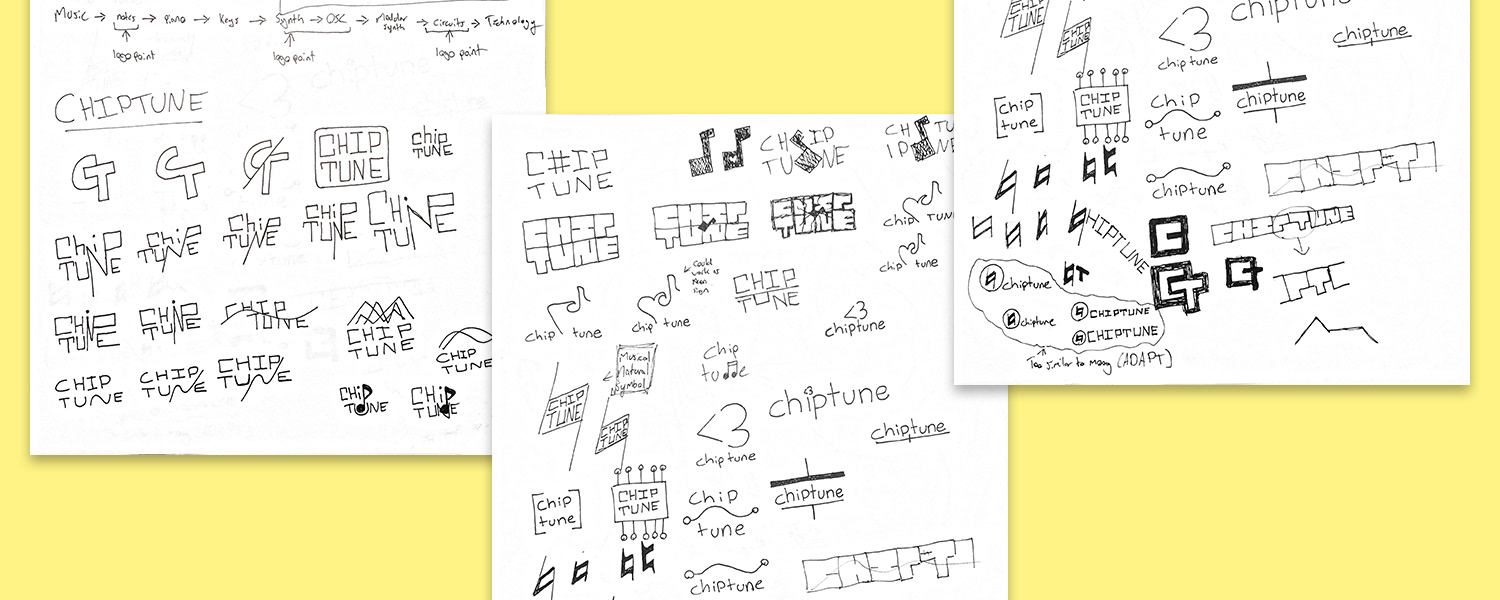
What the logo represents
// The main feature of Chiptune's logo is the musical notation for "natural." Used for it's name, this symbol represents what Chiptune is all about, natural-feeling instruments for real people.

Logo in use
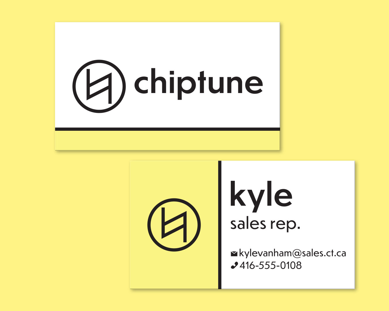
// Whether it be on a business card, or an advertisement, Chiptune's simple, recognizable logo stands out and tells a story. Paired with bold colours, strong lines, and natural photography, Chiptune's brand is easily developed into something even more.


// Promotional images above by Unsplash users Sincerely Media, Blake Carpenter, Hean Prinsloo, and Sam Moqadam.